Glossary Page Redesign
UI Design, UX Design, Concept Redesign, Style Guide, Redlines for Developers
The Objective
Redesign the glossary page for a desktop-only software, referred to as SoftwareX due to confidentiality, to reduce usability pain points, improve search and navigation, and make managing terms more efficient. This was a concept design requested by the Art Director.
My Role
Led the concept redesign from sketches to final layout, applying a strict 4px grid, refining search and button placement, creating new icons, and developing a style guide with redlines for accurate developer handoff.

The Challenge
While reviewing the current Glossary webpage, several usability issues were identified:
Confusing export placement: It was confusing to have an “Export Glossaries” button at the top and another “Export” button directly below it next to the alphabet navigation.
Search placement issue: I expected a “Search” button next to the dialog box instead of the “Advance” button. Placing it there breaks familiar usability patterns users are accustomed to in other software.
Button order needs improvement: The order of the blue buttons at the top did not follow a logical workflow. I suggested the following order and rationale:
Glossary Tool Tip (1st): This should be first because users can immediately access help if they get stuck.
New Glossary (2nd): This should be second because it allows users to create a new glossary quickly without needing to search.
Load Glossaries (3rd): This should follow New Glossary because it relates to accessing glossaries that already exist.
Export Glossaries (last): Export should be last because it’s typically the final action and feels most familiar at the end of a workflow.
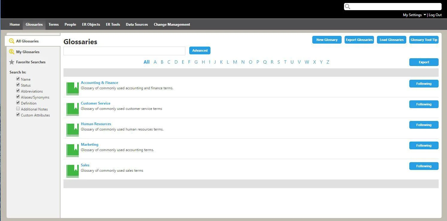
The original glossary page
The best way to improve the user experience would be to have a handful of the company’s clients—Data Stewards and Business Analysts, both tech-savvy and non-tech-savvy—test the current live page and provide feedback on what was difficult and what worked well. Since the users are located around the world, this testing would take place via virtual meetings and screen share.
The Redesign
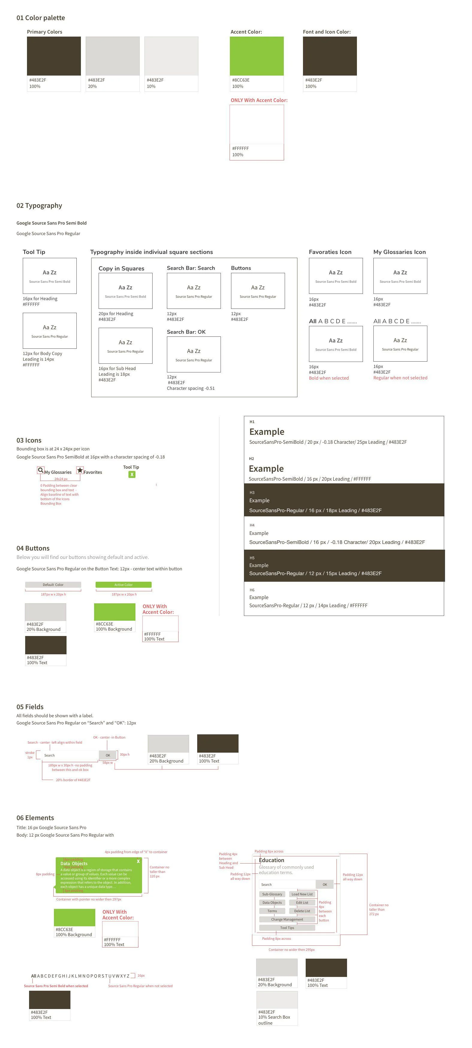
While updating the page, I had to consider specific requirements for the redesigned layout, including a strict 4px grid system where fonts and padding needed to align to 4px increments. There were also requirements related to established Use Cases, which included:
Fast term search: Data Stewards need to locate specific terms and glossary information within 30 seconds, without digging deep into the glossary.
Not all users know glossary terms: Not everyone is familiar with glossary names or terminology, so the design needed to support discoverability.
Easy editing and reorganization: Data Stewards needed to be able to easily edit, change, or rearrange glossary information.
Scalability: The glossary could potentially include thousands of terms, so the design needed to scale efficiently.
The Design Choices
The redesigned glossary page - Showing under the, “ALL” info
Even though this was a redesign, I wanted to keep the style clean and use as much white space as possible. This was important because the page still needed to feel like it came from SoftwareX.
I kept My Glossaries, Favorites, and All (ABC) so users could quickly find what they were looking for, especially if they already knew the name or had previously saved it as a favorite.
Each section was given its own search bar that searches only within that specific grouping. This keeps search results focused and reduces confusion.
For the active state of the buttons, I used the accent color with a white font, matching the style used in the header bar above.
I also used white font in the tooltip to help it stand out and to stay consistent with how the green accent color is treated in other areas of the design.
Style Guide
For the Style Guide, I followed the existing brand system of fonts and colors that needed to be used for the new designs. As part of the redesign, I created additional icons to help users distinguish between different areas more easily. I organized the elements using the Atomic Design System format and red-lined the guide to make handoff easier for the offshore development team.
For the page sample, I included a red-lined markup of the page that was being redesigned.
Conclusion
When first designing the layout, I made a couple of really rough drawings on draft paper with a clear draft ruler and pencils – so I could think in terms of pixels and size. I used Sketch to build the layout of the site as well as the columns and grids. The Style Guide was designed inside of Sketch as well. This design exercise took about one and a half days to complete.
I enjoyed adding the red-lines and learning about how this really helps developers to code a more accurate design. There is software that will produce redlines but, for this project I decided to do them by hand instead.