Credit Union Advantage Website Design
UI Design, Branding, and InVision Demos
The Objective
Redesign the Credit Union Advantage website to modernize the brand, showcase products, communicate core values, create a friendly, accessible experience, and avoid a hospital-like feel.
My Role
Led the design from wireframes to final UI, introducing playful patterns, Detroit-inspired illustrations, and a new accent color. I emphasized ADA accessibility, collaborated closely with the copywriter and developer, and presented the site directly to the client.

The Challenge
CU Advantage is housed inside a hospital, which created several unique design challenges for the new site. Below is the original design, and my updated design is shown shortly after. Some of the problems we needed to address included:
Target audience: They were looking for members who wanted to borrow money.
No style guide: There was no established style guide beyond the green and blue in their logo.
Avoid hospital feel: It was important that the site did not look like it was part of a hospital.
Modern UI (but not too modern): The design needed to feel modern and fresh without going too far outside the brand’s comfort zone.
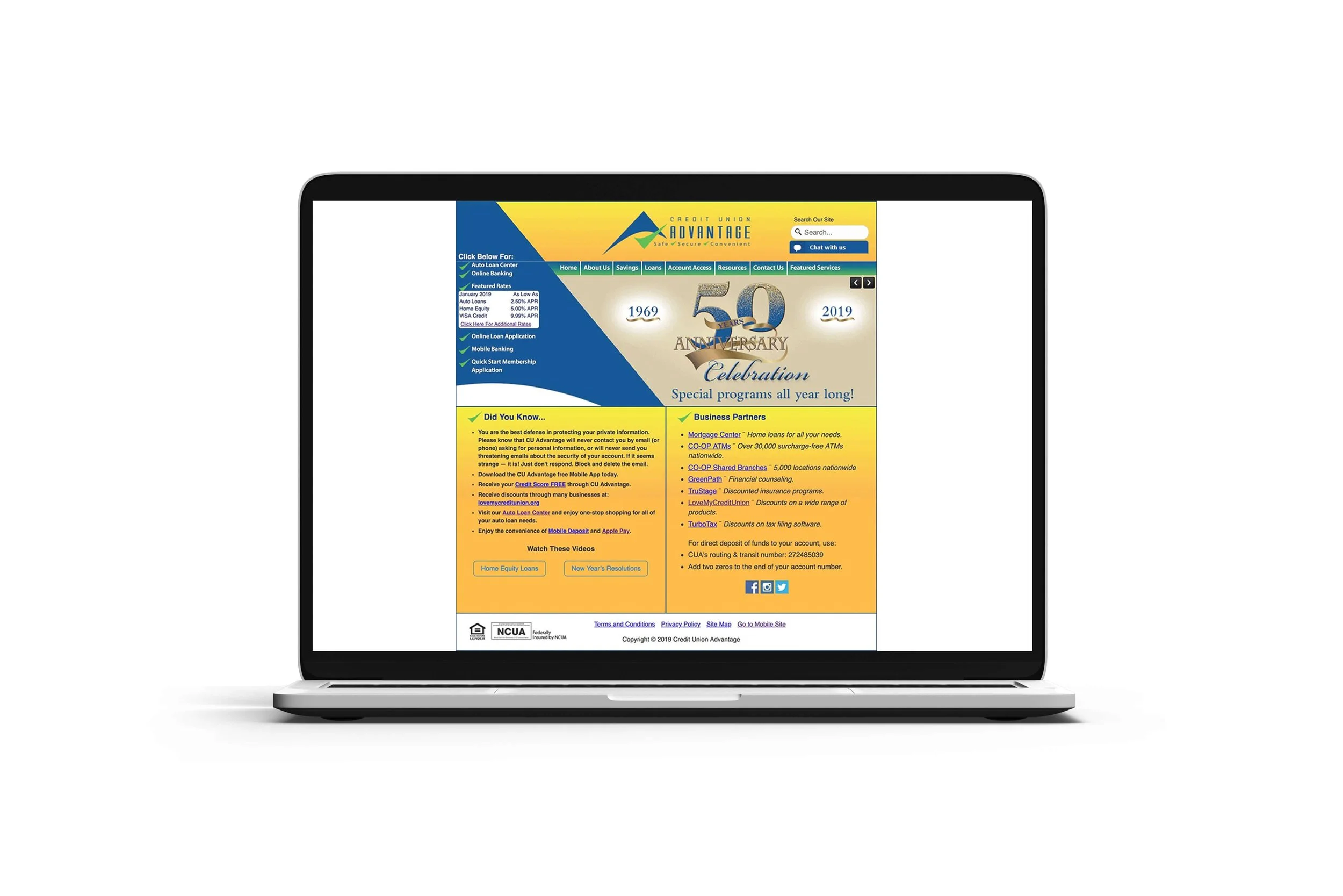
This was the original website design they used for many years before the redesign featured below.
The Solution
As the lead designer for this website and other site designs at Kasasa, I started by researching the bank and identifying their key pain points. I reviewed the sitemap to understand what was most important to them, and I also looked at how they described themselves. These were the key values they emphasized:
Safe
Secure
Convenient
Trusted
The New Design
Before I began the design, I considered several factors, including the sitemap, notes from client conversations, their pain points, and my own research. I always start with quick, lo-fi wireframes—usually several—to help flush out ideas by drawing them and making notes. I also believe it’s important to think in UX principles while designing a website, because the UI and UX need to work in harmony for the site to function as intended. All of these elements helped solve CU Advantage’s challenges. Some of the things I did include:
Added patterns for visual interest: I introduced patterns in different sections on the homepage to create a more modern and playful feel.
Playful product introduction: Since Kasasa products were high in the sitemap, I worked with the copywriter to introduce them in a playful, engaging way.
Detroit-inspired illustration: Because the brand is close to Detroit, I added subtle “Motor City” inspired illustrations to give the site a fun, local touch.
New accent color: I introduced a bright but not overpowering orange as an accent color to bring more energy to the design.

Credit Union Advantage Homepage Redesign
Conclusion
The copywriter and I collaborated closely to make the copy and imagery feel like a cohesive team. By working together, we created a more expressive, playful, and intentional experience that truly reflected Credit Union Advantage. In the end, the customer was very happy with the updated website and appreciated that we listened to their needs and told their story through the new design.
Copywriter: Victoria Kerr
Web Developer: Ashley Sherwood