Beyond Transformation Microsite
UI Design, Branding, Prototyping via Adobe XD
The Objective
Design a microsite to help lenders navigate the COVID-19 landscape by presenting guidance on attracting and retaining customers in a clear, engaging, and user-friendly way.
My Role
Created the full microsite design in Adobe XD, breaking complex content into bite-sized sections and adding purposeful interactivity. I collaborated closely with the developer to implement an animated hero, designed custom tab illustrations, ensured consistent link styling, and incorporated multiple sign-up options while planning for responsive mobile layouts.

The Challenge
COVID-19 was a difficult time for many companies to retain and attract customers, regardless of industry. I was tasked with designing a brand-new microsite page that could present a lot of information in bite-sized chunks while keeping the target audience engaged. Here are some things I considered during research and sketching before building the designs in Adobe XD:
Purposeful interactivity: I wanted to add interactive elements that supported the message and made the content clearer, without overpowering it.
Multiple sign-up options: It was requested that the screen include two different ways for users to sign up for more information.
Client interaction: The client needed a way to interact with the site and access content easily.
Mobile design planning: Knowing some elements wouldn’t translate to mobile, I mapped out the stages before designing the mobile layout.
Asset collection & organization: I collected all the necessary assets (PDFs, infographics, videos, etc.) and ensured everything was ready before sending the designs to the dev team.
The Solution
We needed to focus on UX Best Practices and what the project manager and her team wanted. I understood the goals, the user, and the messaging which allowed me to deep dive into some ideas, to come up with this design. I was able to work directly with our Dev team to implement an animated hero via code, that would allow words to come up one at a time. As well as having conversations about the overlay “ask” that needed to stay within a certain area and having a small form at the bottom of the webpage.

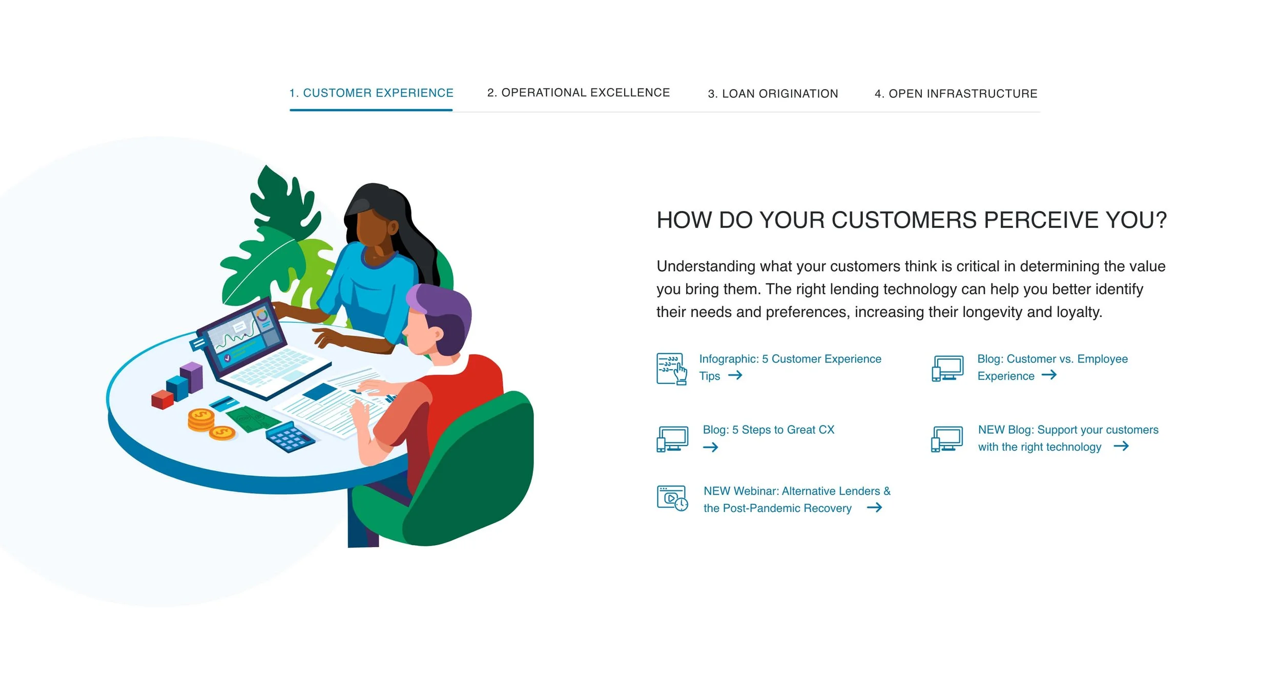
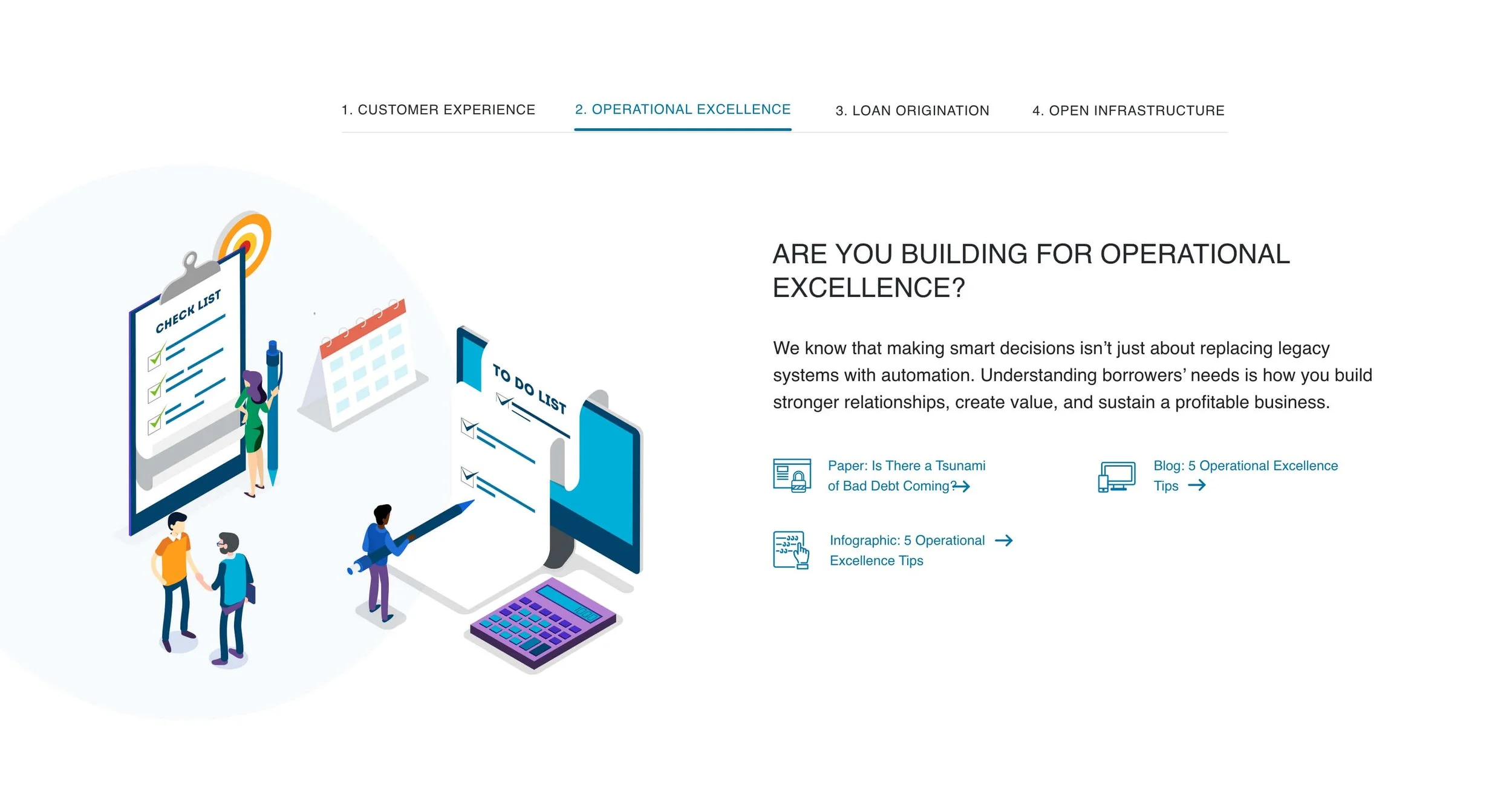
My design idea above for the webpage and below in the next article are the slider elements I designed for the above page.
The New Design
I brought our developer into the design meetings early on to ensure he had bandwidth and to confirm that the interactivity wouldn’t be a huge lift for him. With his help, we brought the animations and interactivity to life, and the goal was successfully implemented. We were also able to track responses from the form and the overlay signup sticky. However, the sticky was not added to the mobile design due to UX best practices, and the animated words remained static on mobile for better readability and performance.
Here are a few additional considerations:
Consistent link treatment: Within each tab, multiple links needed to have consistent styling and behavior.
Custom tab illustrations: Each tab required its own illustration, which I designed using our brand colors and style guide.


Conclusion
The design went through multiple iterations as it was reviewed, and new copy and sections were added several times. With clear communication and consistent follow-up, we were able to keep the process as smooth as possible. Working together as a team, we successfully delivered the project goals and pushed the design further.
Copywriter: Sam Arnold
Web Developer: Michael Cignata