Q2.com Rebrand
UI Design, UX Design, Illustration, Web Design
The Objective
Redesign the Q2 Software website to modernize the brand and showcase new product offerings, including AI, through a more contemporary and user-friendly digital experience.
My Role
Worked as part of a cross-functional team where design responsibilities were divided among web designers; I built 20+ pages, designed all comps in Figma, created new modules to break up dense copy and improve user flow, illustrated product software concepts, and collaborated directly with animators to bring some concepts to life.

The Challenge
For the Q2.com rebrand, we worked in design sprints within an agile environment and faced tight deadlines because many stakeholders needed to sign off on each page. We met regularly with various managers to iterate on pages and ensure changes stayed within the agreed UX/UI system. Several groups of pages had to be handed off to a third-party development team by specific deadlines due to animations and the progressive launch schedule. Here are a few additional challenges we had to address:
Maintain functionality: Edits had to keep the original goal and functionality intact.
Evolving design direction: The design changed multiple times over several months before the final version was agreed upon.
New modules allowed only when needed: We could create new modules, but only if they served a clear purpose.
Time and budget constraints: We had to stay on schedule and within budget.
New pages added mid-project: Many new pages were added during the process, which impacted timelines and scope.
Multiple iterations: The project required a lot of iterations across the entire team.
Conceptual redesigns: We had to transform product information, charts, and software screens into a more conceptual, visually engaging design.
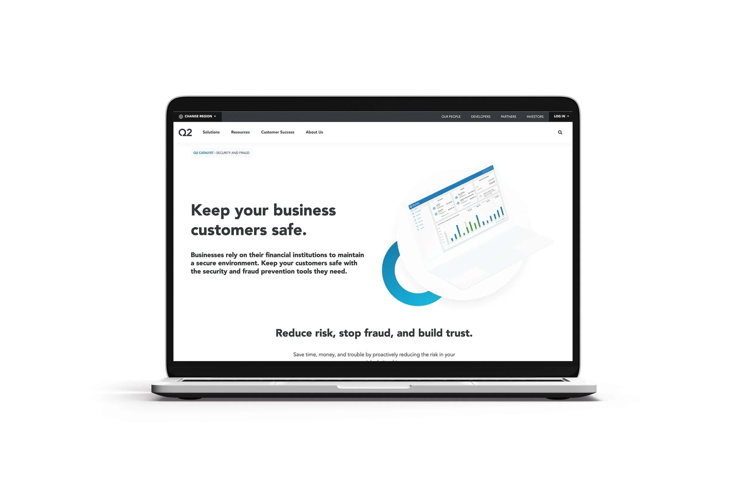
This was the original website design they used before the redesign featured below.
The Solution
Once the design was chosen, we then went back and updated any older pages that were worked on with a different design from the start or redid the pages from scratch. The graphic design team members were very helpful in taking on some of the graphic visuals while we focused on the site itself (although we designed many of the hero and internal page graphics also) we worked as a team on that. Including, working as a team with the motion designer by mocking up a look and walking them through how the animation should work and being open to suggestions and the limitations of Lottie.
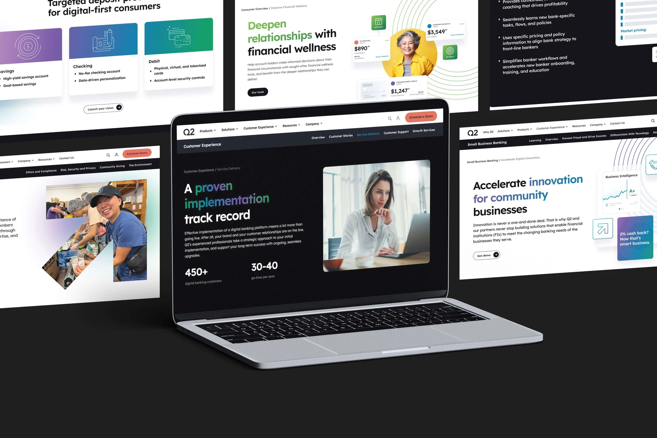
The New Design
The new design was built straight from teamwork, there were so many parts and pieces to these pages and it kept changing course. The site now looks like our new branding and everything going forward will have this new UI to be played off of as a consistent unity in design. Here are a few notable things about the new design:
Modern visual system: The new design is much more modern than the previous version.
Glassmorphism: We incorporated glassmorphism elements throughout the UI to create depth and a premium feel.
Purpose-driven animation: Animation was used intentionally to enhance the user experience, not just for decoration.
Rebranding and consolidation: We brought in various Q2 Software “outlier” sites and rebranded them into Q2.com for a unified experience.
Conclusion
This site was built with a lot of iterations, communication, and, most importantly, teamwork. There would be times when we would hop onto another person’s page that they had designed and help to fix things while they were out or busy with something else. That level of teamwork was needed for everyone involved in this project, which took over 4 months to build. It was a proud moment for everyone when this was built, and there are still pages being added as the year goes on.
Copywriters: Multiple contributors
Web Developers: Built by third-party and in-house teams