TEXASCALE Website Redesign
UI Design, Branding, Prototyping via Figma
The Objective
Redesign the TEXASCALE editorial website to modernize the UI, improve content clarity, and support flexible article volumes.
My Role
Owned the UI redesign from concept to handoff —collaborating with my lead designer and the development team, creating all page comps in Figma, delivering organized files and a full style guide, and designing reusable modules for potential use across the Texas Advanced Computing Center website.
The Challenge
For the redesign of the TEXASCALE page, I had never designed an editorial website before, so I researched how other magazine sites handled large amounts of content. The TEXASCALE site also hadn’t been updated in a long time, so my goal was to make the content easier to digest while giving the site a more modern, user-friendly UI. Below are some key considerations I had to address while designing the new page. Directly below, you can see the original design.
Variable article count: The website corresponds to TEXASCALE Magazine, so the number of articles on the main page can increase or decrease each year. The layout needed to accommodate changing article counts without looking awkward.
Section hierarchy: The sections needed to be clearly highlighted and organized for easy scanning.
Magazine order link: The link to order the magazine had to remain on the main page and fit naturally within the layout.
Placeholder imagery: The actual images would not be included in the comps; the dev team would add them as the pages were built.
Style guide inconsistency: The original style guide was inconsistent, especially with fonts, so I needed to create a new, consistent style guide for the redesign.
Reusable modules: I designed modules that could also be used on the main TACC website.
Desktop-first design: The primary audience views the site on desktop, so I designed desktop first and then ensured the mobile layout worked seamlessly.
This was the original website design they used before the redesign featured below.
The Solution
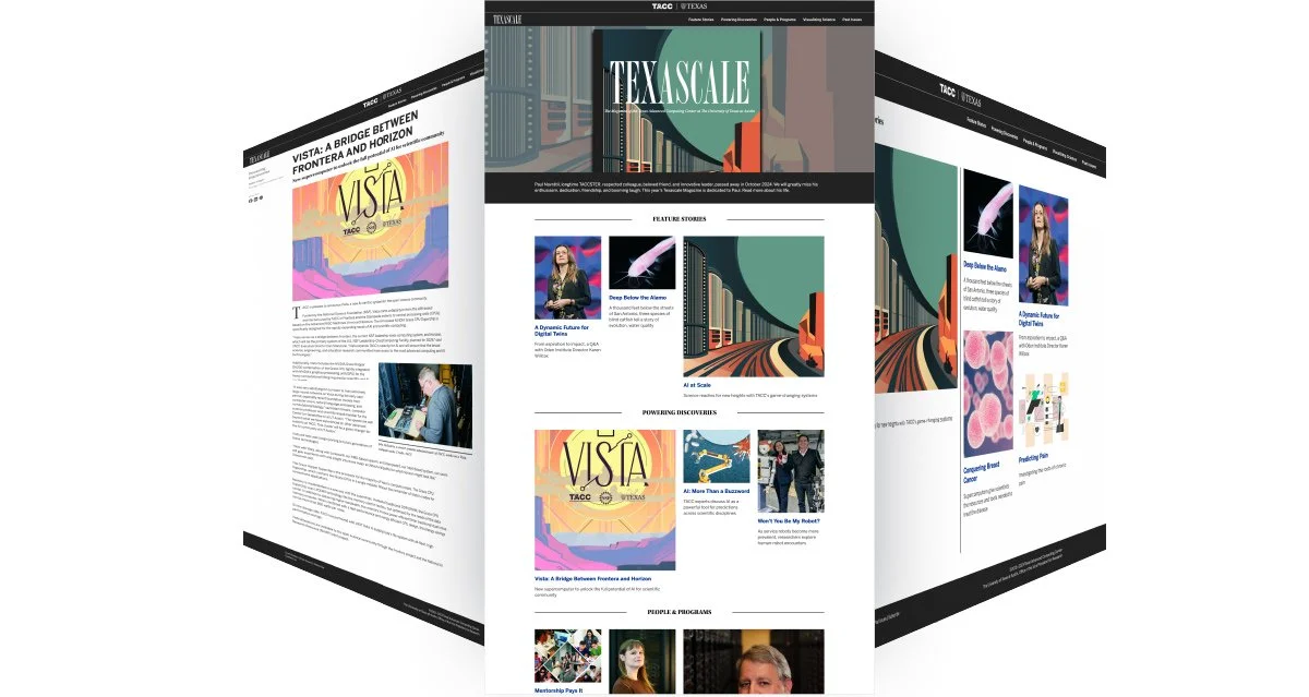
I created three comp designs for multiple pages, including the main page as well as Feature Stories, Getting to Know Us, New Releases and Remixes, and several additional pages. After presenting the options to my lead, we narrowed them down to two to share with the development team. During the dev presentation, I reviewed the project goals and explained how each design supported them. We selected a direction and moved forward through several iterations, while also considering what would work best for the development team and the system they were building on.
Handoff & documentation
Color palette rationale: Explained the new color palette and reasoning behind it to the development team.
Style guide creation: Provided a complete style guide in Figma, including all font sizes for headings and body copy labeled by “H” levels.
Component documentation: Documented interactive and static components for developer reference.
Figma organization: Organized files for easy navigation during handoff.
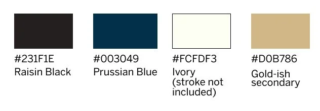
Example of the style guide provided. The “gold-ish” color did not have an official name, as it was a newer brand color used in some areas at TACC.
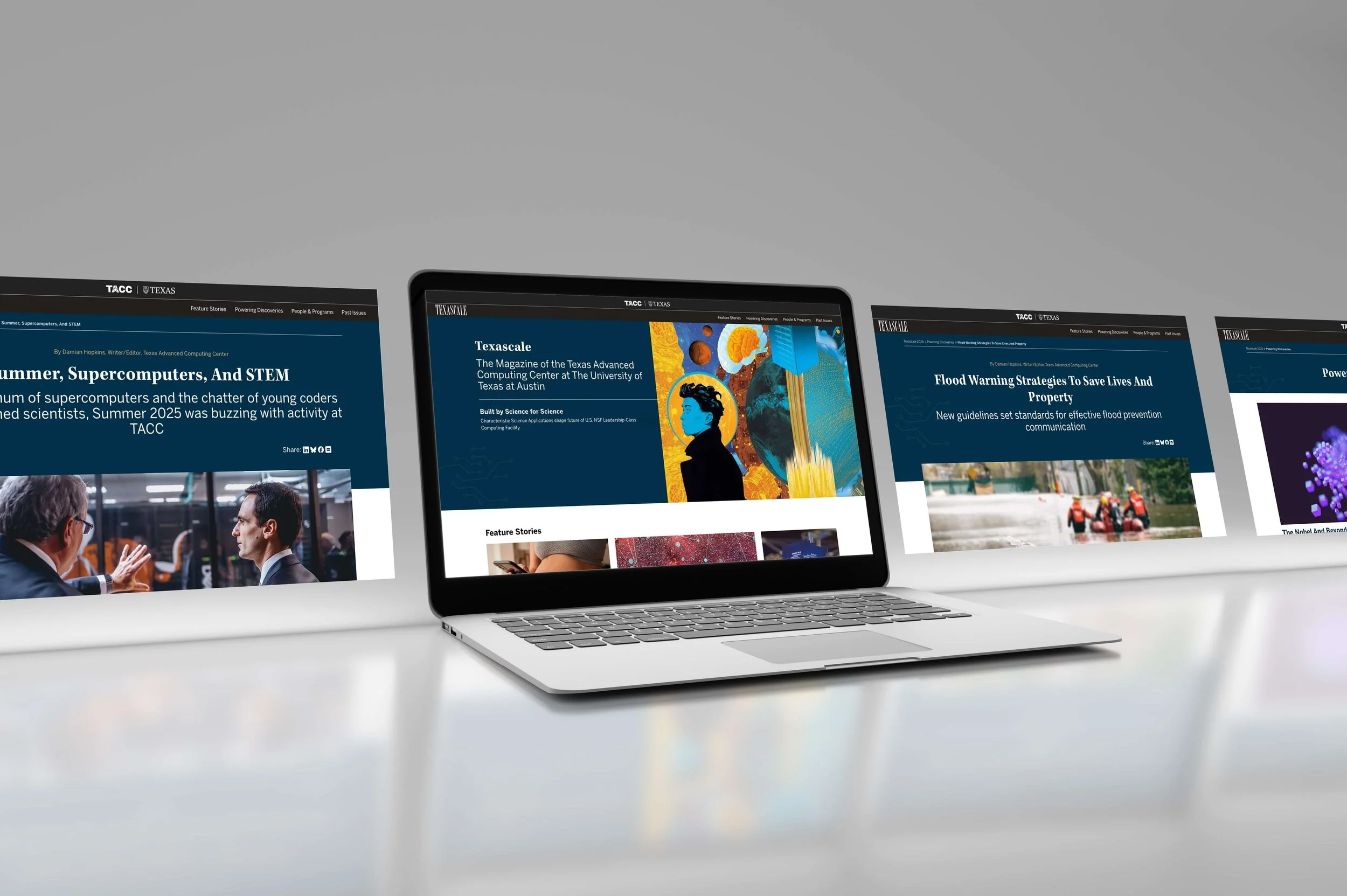
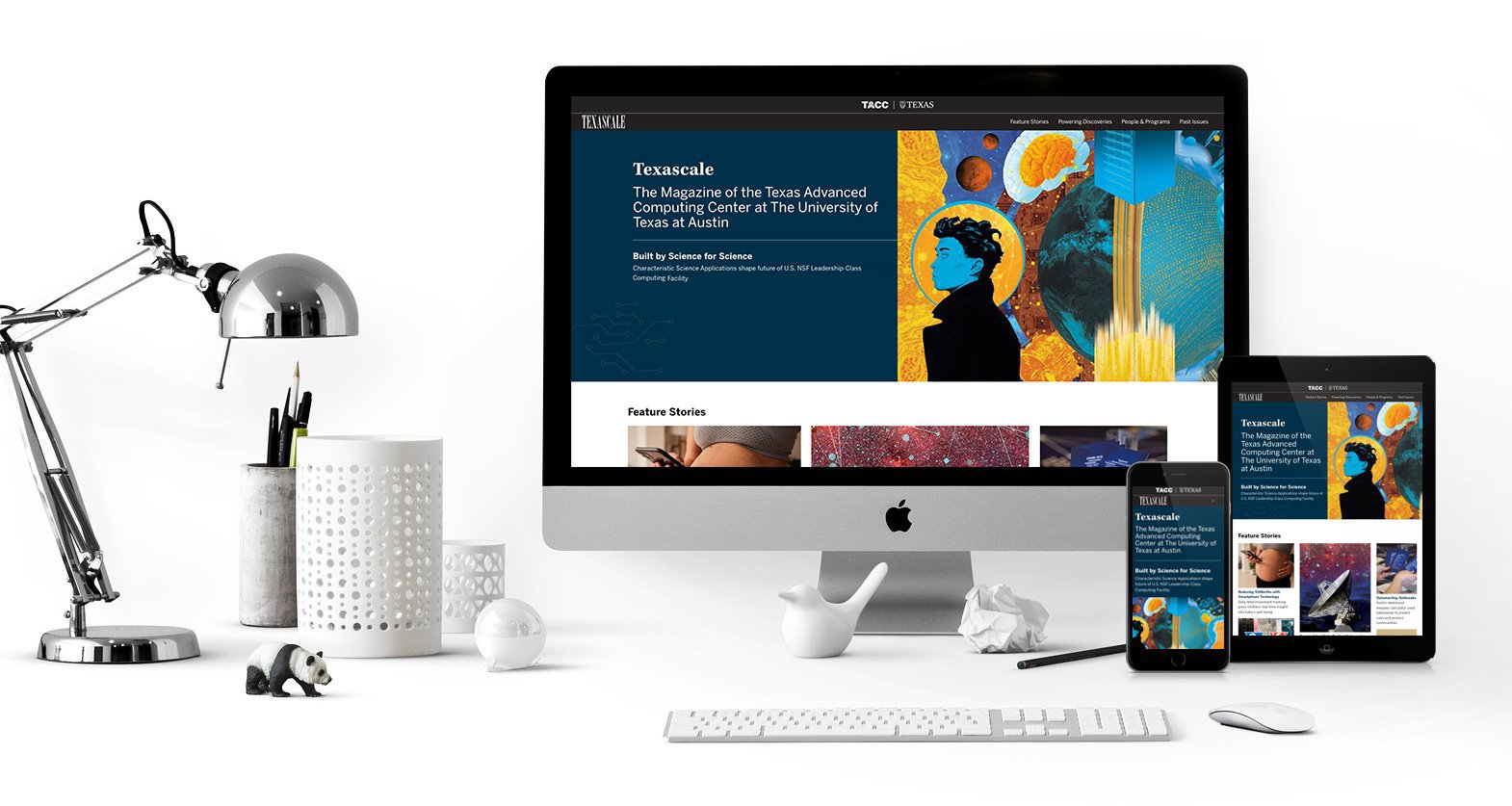
The New TEXASCALE Design
The New Design
My primary goal, beyond adhering to brand standards, was to prioritize the user and create a site that felt modern, functional, and easy to navigate. When I presented the pages to the development team, I made key modules interactive in Figma to clearly communicate their intended behavior, which greatly helped during development.
Here are some other new aspects of the site:
Interactive image hover: On the main page, I designed the images to expand on mouse hover so the links didn’t need to be underlined.
Consistency & QA: Ensured consistency across interactive components and helped QA the website before publishing to catch any issues.
Redesigned story headers: Updated the story headers to better highlight the editor, the story title, and social media icons.
Updated icon design: Worked directly with a developer to replace the “mail” icon so it stood out more across both sites.
Subtle tech illustration: Added a small technology illustration in the corner to enhance the tech feel without distracting from the content in the hero.
Flexible header design: Created three header variations for story pages based on the content while maintaining a consistent design system.
Improved layout for callouts: Suggested using the side columns as callout areas that stay closer to the fold for better visibility.
Additional navigation: Added extra navigation options like “Next Story” at the bottom of the page to improve user flow.
Below is an example of where I was able to add more interactivity while also finding a better way to present a lot of information in small chunks. I worked directly with the dev team to help make this a reality. It went through many rounds of testing and iteration. One of the biggest challenges—on both my side and the dev side—was determining where to place the various controls to make it easier for the desktop user, who is the primary audience. On mobile and tablet, the image and copy stack vertically for a smoother experience.
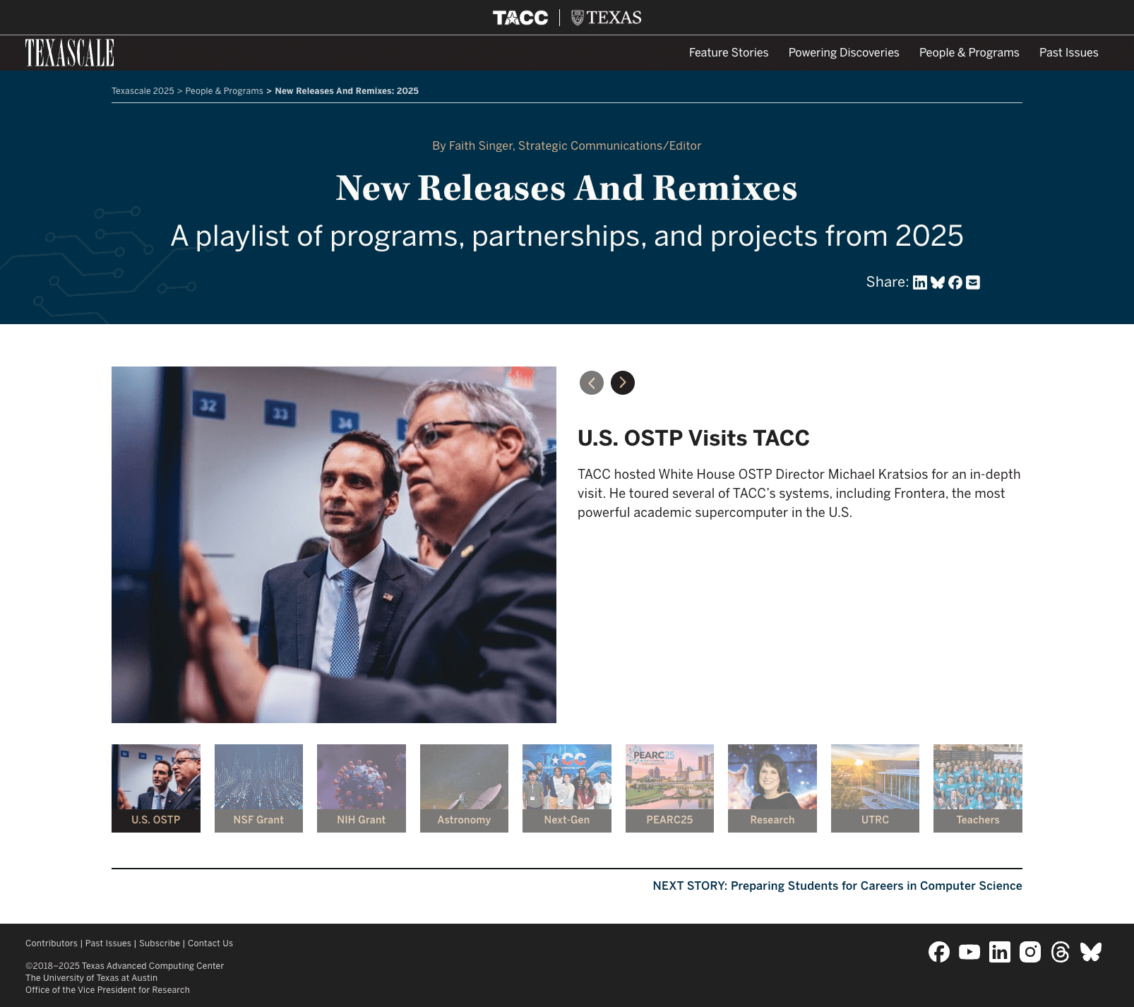
New Releases and Remixes page + inner header/hero designed by me
Conclusion
This was a really neat project because I got to stretch my wings and learn a whole new style of web design. As I mentioned earlier, I hadn’t worked in editorial design before this, and I learned a lot while designing the UI and adding new functionality for the site. I worked closely with the development team, and we continued meeting even after the designs were submitted to review pages as they were built, and made adjustments as needed.
It was an awesome team experience to see how everyone’s role played a part in the final product. While not all of the components I built in the original comps were used on the site, they can be added to the main page as needed or used in the future.
Copy on website: various editors at Texas Advanced Computing Center
Web Developers: Hedda Prochaska and Wesley Bomar